

Opening a Gantt view
Open the Planning page
Select a Gantt view
Reading the timeline
Each task with dates appears as a horizontal bar running from its start date to its end date, in the task’s color. Task names show their full project and task path, so tasks with similar names are easy to tell apart. In a planning set to Bookings, each bar is a booking named after its project and person — see Tasks or bookings. A vertical line marks today, and the timeline extends as you scroll — right into the future, left into the past — with a Today button to jump back to the current date.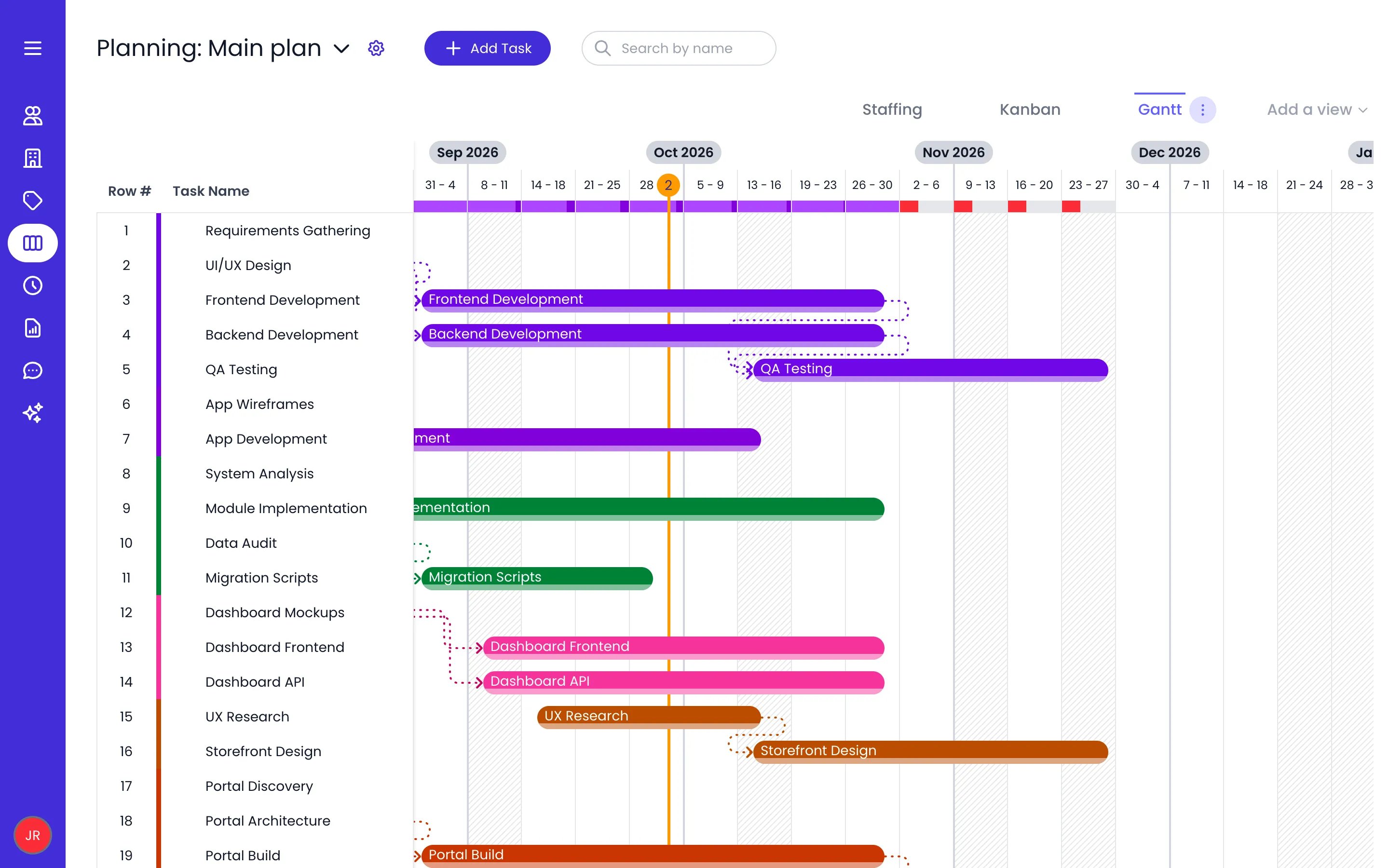
The Gantt view of Main plan, week by week, with dependency links and today's line
Choosing the period
Open the ⋯ menu on the active view tab and use Period to choose how the timeline runs:- Infinite by day or Infinite by week — the endless scrolling timeline, at day or week granularity.
- Day, Week, 2 weeks, 3 weeks, 4 weeks, or 6 weeks — the chart fits that window to your screen and lists only the tasks that fall inside it (parent tasks are kept).
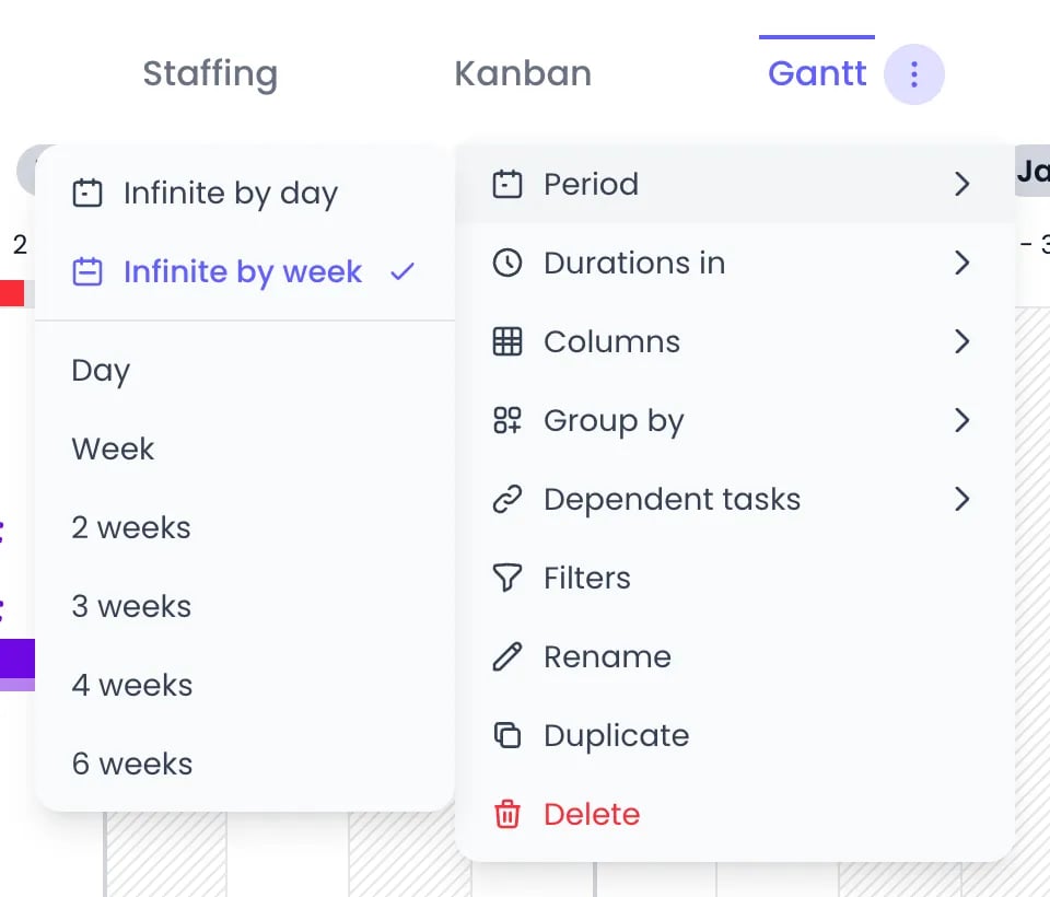
The view tab's menu open on Period
Zooming in and out
Click a cell in the timeline header to zoom one level into that period: from the endless timeline down to the multi-week window you last chose (when it is longer than a week), then to a single week, then to a single day. Hovering the cell first previews the stretch of timeline the click will fill. To go the other way, use the zoom-out button next to the period’s dates, on the left of the view tabs. It names the level it will take you back to (Day, Week, 2 weeks and so on, or ∞ for the endless timeline).Scheduling tasks on the timeline
- Give a task dates — In the row of a task that has no dates yet, click the timeline to create a bar spanning that cell, or click and drag to draw the exact period you want. Dragging on the row of a task that already has dates scrolls to its bar and flashes it instead.
- Move a task — Drag its bar left or right. The duration is preserved.
- Resize a task — Drag the left or right edge of the bar to change the start or end date.
- Work on several tasks at once — Select several bars, then drag them together to reschedule the whole group in one move, hold ⌘ (Alt on Windows/Linux) while dragging to drop dated copies, or grab any selected bar’s edge to shift every selected bar’s dates by the same amount. Press Delete (or Backspace) to remove the whole selection at once. Each batch is a single undo step.
Giving a task hours
A task normally runs over whole days. To pin it to exact times instead, open the task’s Task details panel and uncheck All day — the hint on the checkbox says it plainly: The task runs over whole days. Uncheck to set the hours it starts and ends. Start time and End time fields appear, pre-filled from the owner’s own working hours, and the task now stretches on the clock rather than by whole days:- Dragging, resizing, splitting, and copying the task keep its hours.
- Typing a figure in Planned reflows the task to the exact minute the owner’s calendar can hold that work — skipping their scheduled breaks, days off, public holidays, and time off — and rolls to the next working day only when the current one runs out of hours.
- The capacity a timed task consumes is measured on the hours it actually spans, so a two-hour task no longer counts as a whole day against its owner’s workload.
- On the Staffing timeline, the bar is drawn at its real position inside the day column, with non-working stretches hatched behind it.
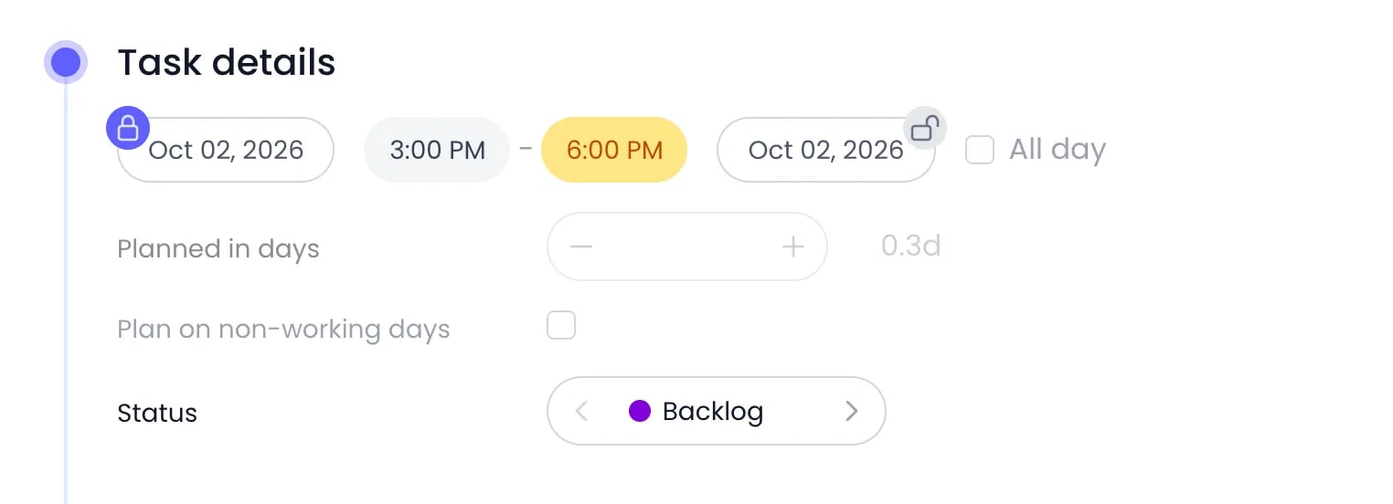
A task pinned to 3:00 PM to 6:00 PM: the end time is highlighted because the owner's day ends at 5:00 PM
Task dependencies
Dependencies sequence tasks: a dependent task is expected to follow the tasks it depends on. Dependency links are drawn between the bars on the timeline, color-matched to the tasks at each end, and they follow the bars live while you drag. The lines route around the bars they pass and around group header rows, so a link stays readable in a crowded chart instead of running straight through a bar.Drawing a link on the timeline
Hover a bar and a chain-link handle appears on the half of the bar you are pointing at — the start or the end. Both work the same way, in opposite directions, and the handle’s tooltip says which one you have: Link the end of this task, then Drag onto a task, or click the tasks that start after it (hold ⌘ for several).- Drag the handle onto another task and release to create the link.
- Hold ⌘ as you release to keep the handle armed, so you can chain several tasks one after another without grabbing it again.
- Release the handle where it is and it stays armed instead: click tasks in the list to link them, and click again to finish.
- While a handle is armed, tasks already linked to it wear a broken-chain mark — click one to remove that link.
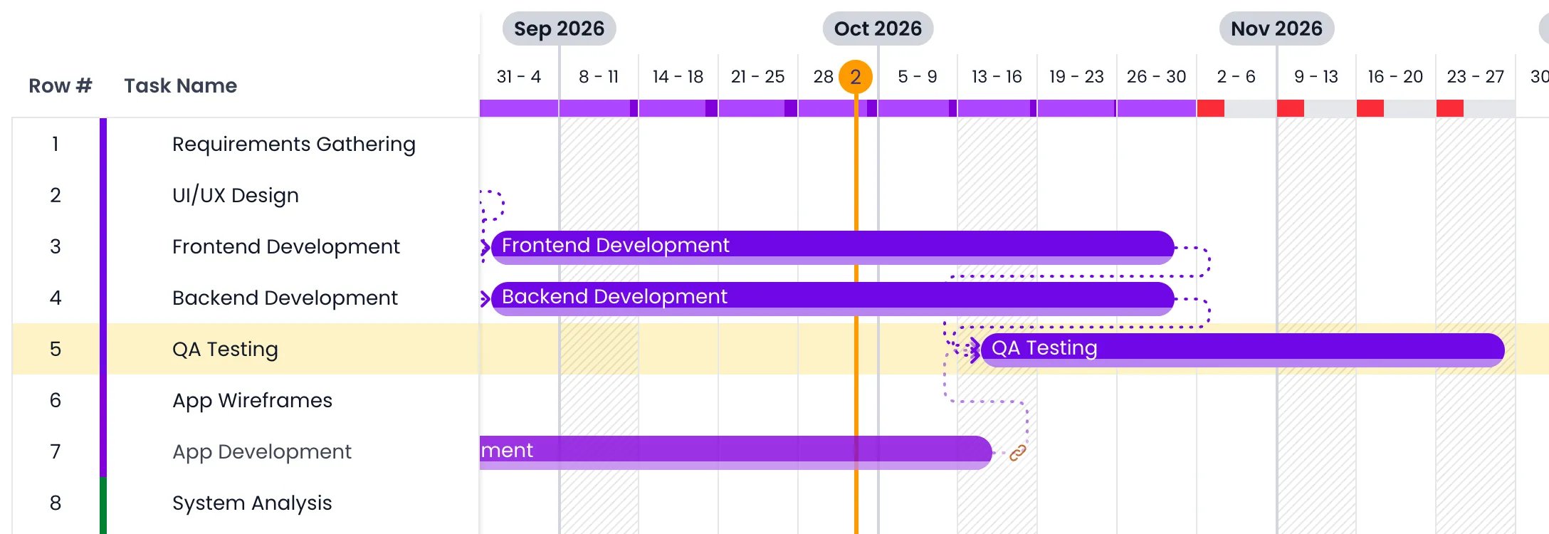
The end handle of App Development dragged onto QA Testing, before the release
Adding dependencies from the column
Dependencies are also managed in the Dependencies column — add it from the Columns menu if your view doesn’t show it.Click the task's Dependencies field
Pick its dependencies
Finish
How dependent tasks move
Open the ⋯ menu on the active view tab and hover over Dependent tasks to choose what happens to dependent tasks when you move a task they depend on. The submenu is titled Dependent tasks movement options, and each option animates on hover so you can see the behavior before picking it:Planned time
The Planned column shows each task’s planned work. The small button in the column header toggles the unit (Planned in hours or days); the same choice sits under Durations in (Hours or Days) in the view tab’s ⋯ menu. A parent task shows the total planned time of its subtasks.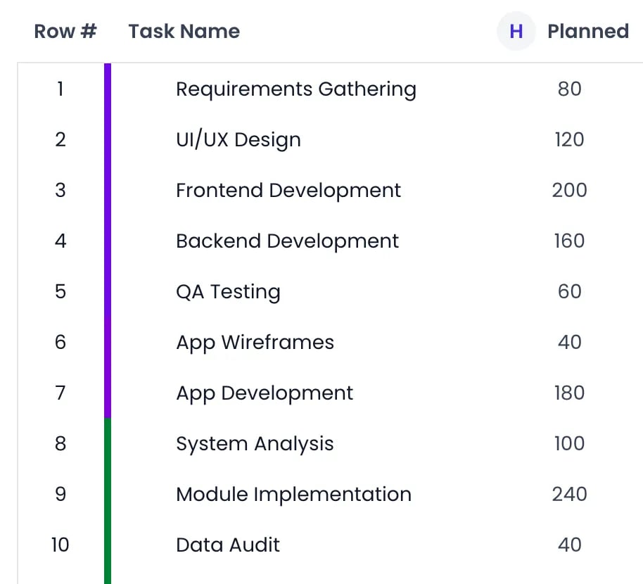
The Planned column in hours, with its unit button in the header
Workload heatmap
When the chart is grouped, each group header row carries one cell per period (day or week, following the current Period granularity). What the cell draws depends on what you grouped by.- Grouped by Owner — Each owner’s row shows a load bar comparing that person’s planned time to their capacity for the period. The bar fills red while capacity remains, turns green when the capacity is met exactly, and turns purple as soon as the person is booked beyond it, with the overload share in a darker purple.
- Grouped by anything else — For project categories, tag categories, statuses, and the “no owner” bucket of a grouping by owner, the cell shows the group’s total planned time as a figure above a bar scaled to the busiest period on that row. A capacity ratio has no meaning for a group of people, so none is drawn. Planned time that has no owner yet appears as a small red badge in the corner of the cell.
- Without grouping — A single load bar sits under each day or week number in the timeline header, rolling up everyone. Click it to step the scroll through the rows driving that period’s load.
- Hover for details — A tooltip names the period, then the planned time against capacity (for example
Planned: 32 / Capacity: 40 (80%), in your organization’s duration format), and adds a line per overloaded person with their own figures.
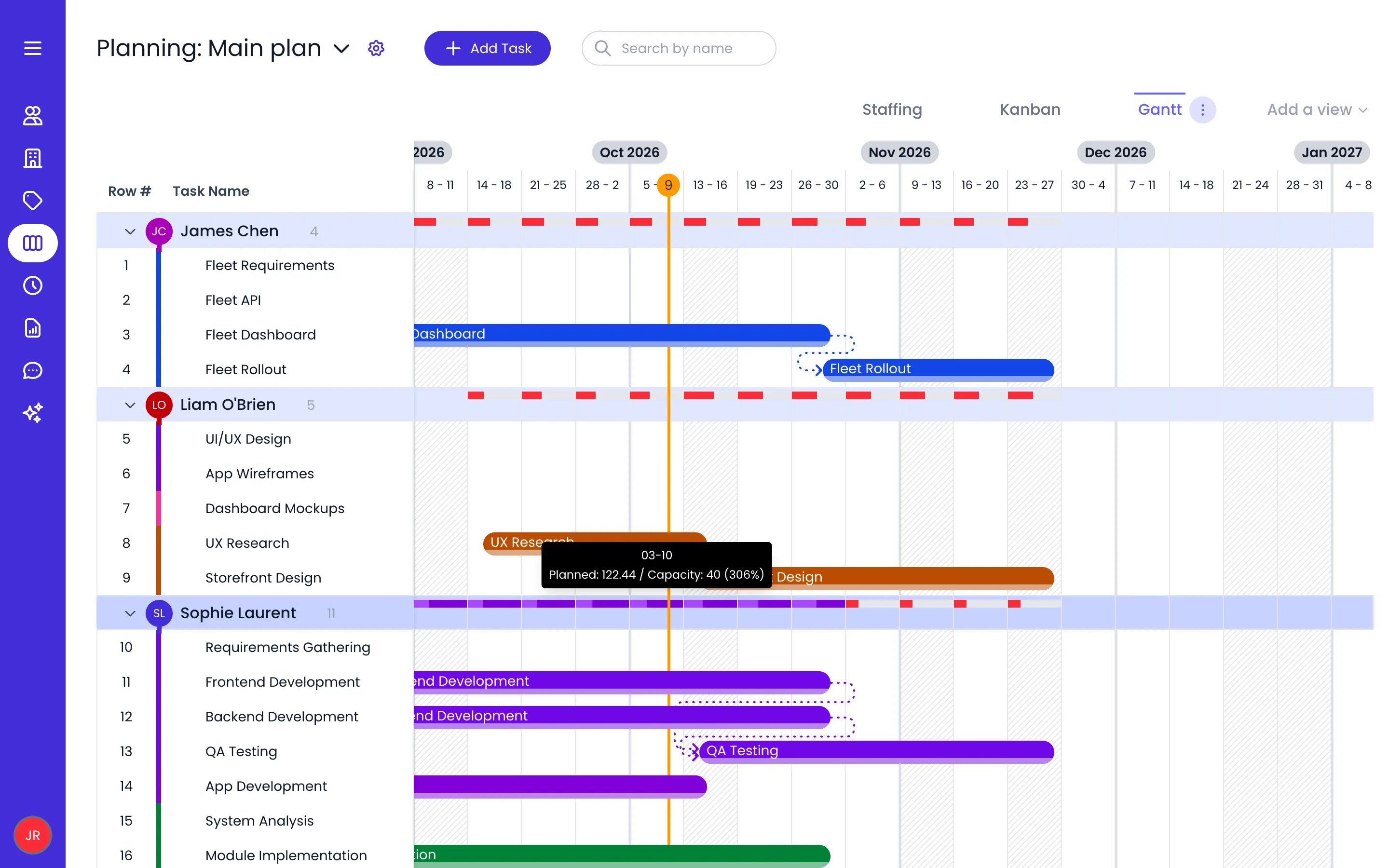
Grouped by Owner: load bars per week, and the tooltip of an overbooked week
Columns
The left panel of the Gantt chart is a configurable table. Open the ⋯ menu on the active view tab and hover over Columns to show or hide columns. Row # and Task Name are always visible — a new Gantt view starts with just those two.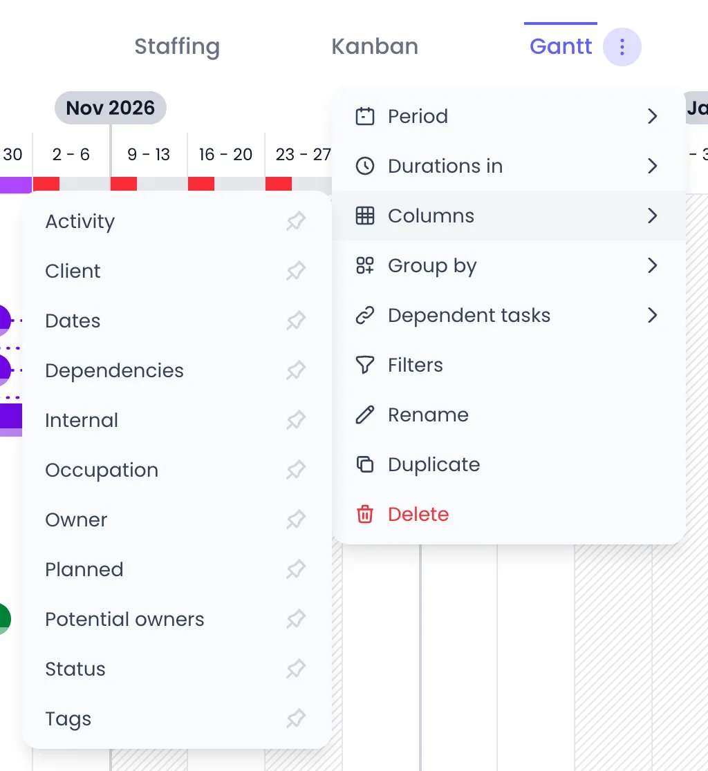
The Columns submenu: click a column to show or hide it, a dark pin marks the columns shown
Reordering, resizing, and sorting columns
- Reorder — Drag a column header sideways and drop it where you want it. Row # and Task Name stay first and can’t be moved.
- Resize — Drag the right edge of any column header. Widths are saved with the view.
- Sort — Click a column header to sort the rows by that column, click again to reverse the direction, and a third time to return to the manual order. An arrow on the header shows which column is sorted and which way. Hovering a header opens its menu, which names the same actions: Sort ascending, Sort descending, and Hide column (Task Name can’t be hidden).
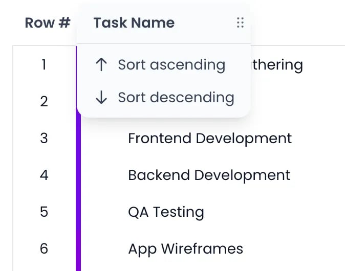
The Task Name header's menu, opened by hovering it
Editing in the columns
The value cells are controls, so most task fields can be set without opening the task:- Status — Step to the previous or next status with the chevrons, or click the status name to pick any of them.
- Owner — Remove the current owner from its badge, or use the person button on an empty cell to pick someone (Select the owner).
- Dates — Click the cell to open the task’s period editor.
- Planned and Occupation — Type the figure straight into the cell.
- Potential owners — Hover the row for two buttons, one to add a person (Select person) and one to add a tag (Select tag). Each opens its own small editor with the current people or tags as removable badges and a picker to add more.
- Tags and each project category column — Click the + button for a small editor with the current badges, removable, and a picker to add more.
Adding tasks in place
You can name new tasks straight in the task list. Hover over a row and click the + button next to the task’s name: a name field opens under the row, and what you type becomes a subtask of that task. When the chart is grouped, each group header has its own + button (Add Task), which opens the field at the top of the group; the new task gets the group’s owner, status, or project. Press Enter to save the task and open a field for the next one, or paste a list to add several at once. Hold ⌘ (Ctrl on Windows) as you click a + to open the full add form instead, with the same values filled in. In a Bookings planning, both buttons open the Add Booking form. See Adding tasks in place for the details.Row grouping
Open the ⋯ menu on the active view tab and hover over Group by to restructure the list without changing any task data:- Owner — One group per task owner
- Status — One group per status
- A project category — Hover its name and pick one of its levels
- A tag category — Hover its name and pick one of its levels
Saved views
The tabs above the task list are saved views. Each Gantt view stores its own Period, Columns (which ones, in what order, at what width), sort, and Group by settings, plus its filters.- Create — Click Add a view, then Gantt chart.
- Reorder — Drag a tab sideways and drop it where you want it.
- Rename — Double-click the tab (or long-press it on a touch screen) and type the new name, or use Rename in the tab’s ⋯ menu.
- Duplicate or delete — Use Duplicate and Delete in the ⋯ menu. The last remaining view cannot be deleted.
Filtering
Use the Filters button to narrow the chart — by task, status, owner, potential owner, project, or tags — with the active filter count shown on the button. Filters can be switched off and back on without losing them: the button toggles them rather than clearing them.Keyboard navigation
With the Gantt chart focused, you can work without the mouse:Related content
Tasks
Kanban board
List view
Work schedules
Frequently asked questions
Does Beebole's Gantt chart have a month view?
Does Beebole's Gantt chart have a month view?
How do I create a dependency between two tasks?
How do I create a dependency between two tasks?
What happens to dependent tasks when I move their predecessor?
What happens to dependent tasks when I move their predecessor?
Can I have several Gantt views with different columns?
Can I have several Gantt views with different columns?
Do changes in the Gantt chart affect the Kanban board?
Do changes in the Gantt chart affect the Kanban board?